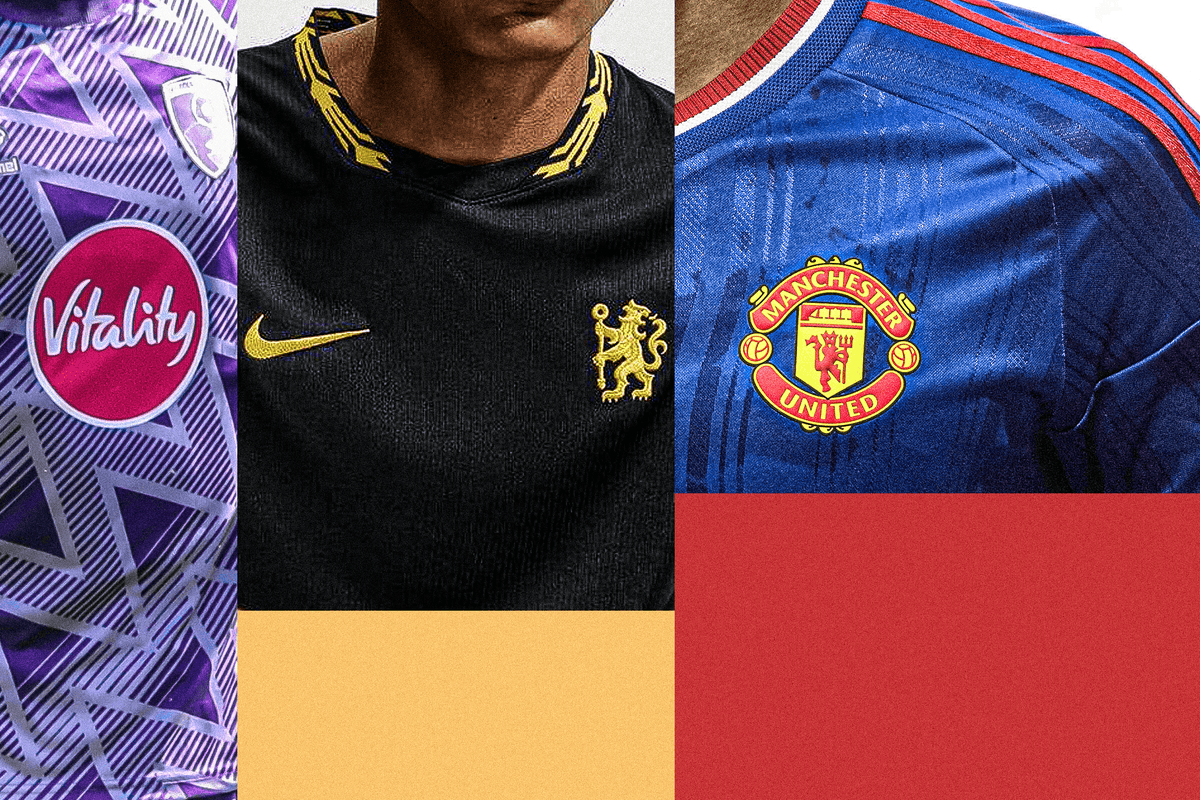
Английн Премьер лигийн багуудын 2026-27 оны улиралд өмсөх зочин багийн өмсгөлүүд нь түүхэн уламжлал, соёлын нөлөөлөл болон этгээд шийдлээрээ олны анхаарлыг татаж байна.
Премьер лигийн багууд энэ улиралд зочин багийн өмсгөлөө загварчлахдаа түүхэн дурсамж, хотын онцлог шинжийг тусгахыг эрмэлзжээ. Тухайлбал, Манчестер Сити баг Манчестер хотын бэлгэдэл болсон зөгийн дүрсийг өмсгөл дээрээ байршуулсан бол Сандерленд баг Элвис Преслигийн уран бүтээлээс сэдэвлэсэн ягаан өнгийн өмсгөл танилцуулсан нь олны анхаарлыг зүй ёсоор татаж байна.
Ноттинхэм Форест баг ойн модноос сэдэвлэсэн ногоон өнгийн өмсгөлөөрөө өвөрмөц шийдэл гаргасан бол Арсенал, Ливерпүүл, Эвертон зэрэг багууд сонгодог загварын чиг хандлагыг баримтлан, уламжлалт өнгө төрхийг шинэчлэн харууллаа. Брентфорд багийн хувьд Савил Роугийн загварын өв уламжлалыг илэрхийлсэн гэх боловч Миллуолл багийн өмсгөлтэй төстэй харагдаж байгаа нь хөлбөмбөг сонирхогчдын шүүмжлэлийг дагуулж байна.
Зарим багийн өмсгөлүүд шүтэн бишрэгчдийн таашаалд нийцэж байгаа ч Тоттенхэм болон Челси багийн шинэ загварууд нь чанар болон хийцийн хувьд эргэлзээ төрүүлсэн хэвээр байна. Премьер лигийн багууд ийнхүү өмсгөлийнхөө загварыг олон нийтэд танилцуулж, ирэх улирлын өрсөлдөөнд бэлтгэлээ базааж эхэллээ.
Дэлгэрэнгүйг эх сурвалжаас харах
↓Эх сурвалжийг нээх ↓
The home kits have been ranked to within an inch of their life, so now it’s time for the aways.
This is where there are usually a few experiments, some more ‘out there’ designs, so step up for some pretty wild stuff, including a kit based on trees, one linked to the United Kingdom prime minister’s tattoo and one inspired by Elvis Presley.
(Brendon Thorne/Getty Images)
Nope. This looks like someone has taken a dark blue shirt, left a plastic, multi-coloured slinky on top of it, then left it out in the baking sun until it melted and became one with the shirtl, which is not meant as a compliment. The blurb on the Spurs website claims it has “never-before-seen visuals inspired by never-before-seen destinations” but doesn’t really elaborate on what those theoretical destinations are. Ultimately, it’s just a shirt that will make you go cross-eyed if you stare at it for too long and that can’t really be a good thing.
Photo:
(Brendon Thorne/Getty Images)

(Brendon Thorne/Getty Images)

(Brendon Thorne/Getty Images)
Look, let’s not take the manufacturers’ blurbs too literally or indeed seriously, but consider this from Nike: “A celebration of Chelsea FC’s own ‘Italian Renaissance’, their 2026-27 away kit’s black base and luxurious gold trim details pay homage to their transformative 1990s era.” Now, a couple of things: first, I don’t like the shirt. Black football shirts have to work pretty hard to look nice and this doesn’t, really, because the yellow on black makes it look like a promotional T-shirt for a toolmaker. But second, if for some reason you want to pay tribute to Italy, why black? Obviously, they couldn’t do Azzurri blue for a Chelsea away kit, but… I dunno — red, white and green maybe? Ultimately, little of that matters because the shirt is no good anyway but that irritated me, so unfortunately you have to hear about it.
Photo:
(Brendon Thorne/Getty Images)
(Brendon Thorne/Getty Images)

(Hull City FC)
Apparently this is a tribute to a Hull away kit from the late 1980s, which is all very well and good, but it’s also quite boring. The fact it’s a clean white design — thus differentiating it from the home shirt but with elements of their distinctive colours on it — is fair enough but otherwise, there’s not much to really recommend it. This shirt is the equivalent of a person you meet at a wedding: they tell you all about their Volvo and offer some extremely vanilla, entry-level football opinions, then you forget them as soon as you leave their company.
(Hull City FC)

(Brentford FC)
Apparently this shirt is was designed in collaboration with Brentford shareholder and Kingsman director Sir Matthew Vaughn and “pays tribute to the craftsmanship and heritage of Savile Row”. Let’s leave aside whether the Kingsman films are culturally ubiquitous enough to warrant a reference in a football shirt, never mind who your shareholders are, and address the elephant in the room:this is a Millwall shirt. The only surprising thing is that, among your Erreas and your Macrons and your Buktas, Millwall appear to have never had Joma, the maker of this ‘Brentford’ shirt, as their kit supplier. This doesn’t necessarily make it bad: pinstripes on football shirts, despite what the haters and losers might say, are good. It’s clean, unfussy and, in a vacuum, looks way better than their away shirt from last season. But it looks like a Millwall shirt and is thus going to be too distracting when they wear it.
(Brentford FC)

(Coventry City FC)
(Coventry City FC)

(Chung Sung-Jun/Getty Images)
Is this the first football kit that has a direct link to a tattoo sported by the sitting prime minister? Andy Burnham got the famous Manchester worker bee logo inked on his arm while mayor of the city and this shirt has that very same motif scattered all over it. Perhaps Margaret Thatcher had the Manchester United devil on her shoulder or Winston Churchill had an Arsenal cannon tramp stamp: history has not recorded that, so we’ll say this the first one we know about for sure. Either way, it’s slightly surprising that City haven’t used the bee on their jerseys before given its local significance and the fact you see it everywhere when you’re in Manchester. However, while the sentiment is wonderful, the actual shirt isn’t great visually, which is a shame.
Photo:
(Chung Sung-Jun/Getty Images)
(Chung Sung-Jun/Getty Images)

(Daniela Porcelli/Getty Images)
There’s a small caveat here in that this might not technically be Palace’s official away shirt because they’ve quite carefully announced it as an ‘Eagle Black’ shirt rather than officially referring to it as their away strip… but in the absence of anything else, we’re classing this as their away. I’m instinctively inclined to say this is quite ugly, which, in isolation, it is, but the embossed eagle pattern on the background is OK and they do get some points for an element of tradition, given Palace do often go with a black away shirt.
Photo:
(Daniela Porcelli/Getty Images)
(Daniela Porcelli/Getty Images)

(Pete Norton/Getty Images)
A precise colour-flip from the home shirt, which is blue with white pinstripes, as opposed to the white with blue pinstripes we see here. The age-old question presents itself: is this good, joined-up thinking, the concept of manufacturers coming up with these things ‘as a collection’ or just a bit lazy, like those parents who dress twins identically? Does that actually matter? Is the important bit just to have kits that look good and nobody really cares if the away is the inverse of the home? If it’s the latter, this is perfectly fine, if slightly dull, but entirely adequate.
Photo:
(Pete Norton/Getty Images)
(Pete Norton/Getty Images)

(Johnnie Izquierdo/Getty Images
Photo:
(Johnnie Izquierdo/Getty Images
(Johnnie Izquierdo/Getty Images

(Robin Jones – AFC Bournemouth/AFC Bournemouth via Getty Images)
Photo:
(Robin Jones – AFC Bournemouth/AFC Bournemouth via Getty Images)
(Robin Jones – AFC Bournemouth/AFC Bournemouth via Getty Images)

(Stu Forster/Getty Images)
Photo:
(Stu Forster/Getty Images)
(Stu Forster/Getty Images)

(Aston Villa FC/adidas)
As an instinctive black football shirt sceptic, I need some persuading whenever a team goes in that direction but this one actually works. For a good black shirt, you need to either fully commit to it and go full blackout with no other colours at all, or you need some strong contrast colours that are identifiable with that club. And this does the latter quite nicely, the classic claret and blue along with a gold trim offsets the whole thing rather well. It’s always a gamble but one that has paid off this time.
Photo:
(Aston Villa FC/adidas)
(Aston Villa FC/adidas)

(Dustin Satloff/Getty Images)
Really nice, back to basics stuff: just red and white, no mucking around, here’s what it is, let’s not complicate things. It’s quite similar to a couple of away shirts Liverpool had in the 2010s and most of their away shirts from the 1980s, but the Adidas blurb claims it’s inspired by the “ticket stubs from the club’s iconic matches of the ‘70s and ‘80s”… and we’ll have to take their word for that because I’ve peered as closely as I can at the background design on the main body and I can’t see anything ticket-stubby. What other piece of relatively banal club-related ephemera could inspire a shirt design? Car park signs? Concrete steps? The pen Rafa Benitez used to make little notes with? Still: nice shirt.
Photo:
(Dustin Satloff/Getty Images)
(Dustin Satloff/Getty Images)

(Carl Recine/Getty Images)
Really excellent. This apparently references a very niche design from the 1950s, something that only the most committed Everton completist/nostalgist would probably have spotted, but that doesn’t matter because it’s a beautifully clean design, a lesson in how to do simple but not dull. It just goes to show that opinions can change: I had dismissed Castore as a rugby brand, the sort of thing one wore underneath a navy blue quarter-zip and paired with jeans and brown brogues, but its kits for Everton in the last couple of seasons have been excellent.
Photo:
(Carl Recine/Getty Images)
(Carl Recine/Getty Images)

(Leonardo Fernandez/Getty Images)
Photo:
(Leonardo Fernandez/Getty Images)
(Leonardo Fernandez/Getty Images)

(Emmanuele Ciancaglini/Ciancaphoto Studio/Getty Images)
Sensational. You don’t get a lot of deep green in the football shirt world but when you see it pulled off like this, with the red shoulder stripes providing a lovely contrast, you wonder why. The inspiration is all quite ‘on the nose’: it’s green because forests are green… and the background pattern is leaves… which you’ll find on trees… which are in forests. Forest have had green away shirts before but this is the classiest of the bunch.
Photo:
(Emmanuele Ciancaglini/Ciancaphoto Studio/Getty Images)
(Emmanuele Ciancaglini/Ciancaphoto Studio/Getty Images)

(Fran Santiago/Getty Images)
Yes please. An exceptional bit of business, this: all chequerboard shirts usually look great but Adidas and Fulham have taken a slight gamble here by playing with the form, making the squares with jagged edges rather than straight, ones but it works really nicely. And this is without considering the old-style badge, which references the one Fulham used in the 1970s, and also, that the whole design is a nod to one of their away shirts from the early 90s. If we’re nit-picking, the effect is hampered a little bit by a sponsor’s logo that is simply too big, but even that can’t spoil things completely.
Photo:
(Fran Santiago/Getty Images)
(Fran Santiago/Getty Images)

(Michael Campanella/Getty Images)
This is a nod to some iconic United kits of the past, most obviously the one they won the 1968 European Cup in, but apparently the most direct inspiration is a cult third kit they only wore three times, all in away games against Southampton, in the 1980s, which is pleasingly niche. The deep blue with red trim is a combo that they have done a few times in recent years but this is probably the best version of it, with the red shoulder stripes but also just the right amount of white on the trim too. Very good indeed.
Photo:
(Michael Campanella/Getty Images)
(Michael Campanella/Getty Images)

(Alex Burstow/Getty Images)
Photo:
(Alex Burstow/Getty Images)
(Alex Burstow/Getty Images)

(Alex Caparros/Getty Images)
Superb. The blurb for this shirt makes reference to the now classic ‘bruised banana’ design and while that might seem strange given the shirt is blue (fun fact: you can actually get blue bananas in some areas of south-east Asia, apparently), this is a pretty good way of continuing a fan-favourite design but not just trotting the same shirt out every season. The yellow and red trim pops perfectly from the dark blue background, and there’s a pleasing colour consistency with the Adidas trefoil, the Arsenal badge and the sponsor. Once more: superb.
Photo:
(Alex Caparros/Getty Images)
(Alex Caparros/Getty Images)
Connections: Sports Edition
Spot the pattern. Connect the terms
Find the hidden link between sports terms
Play today’s puzzle