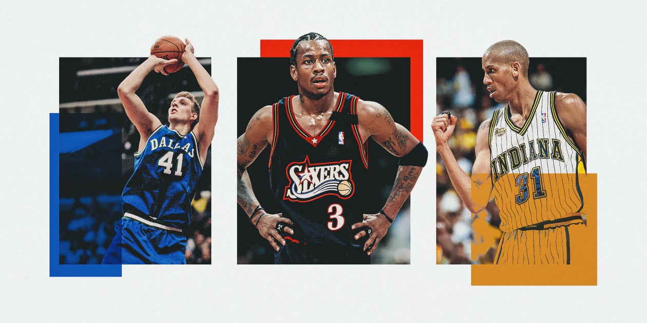
NBA-ийн багууд 2000 оноос хойш ашигласан өмсгөлүүдээсээ эргүүлэн ашиглах боломжтой шилдэг сонголтуудыг The Athletic-ийн багийнхан нэрлэжээ
NBA-д загварын чиг хандлага нь тоглогчдын хувийн онцлогийг илэрхийлэх чухал хэсэг болсон бөгөөд түүхэн дэх дурсамжтай өмсгөлүүд нь фанатуудын хувьд тоглогчидтойгоо адил ач холбогдолтой байдаг. The Athletic-ийн NBA-ийн багийнхан 2000 оноос хойш ашигласан өмсгөлүүдээс тус бүр нэгийг сонгон авч, багууддаа дахин ашиглахыг санал болгосон байна. Хэрэв интернэт дэх мэдээлэл үнэн бол ойрын саруудад эдгээр өмсгөлүүдийн заримыг талбай дээр дахин харах боломжтой болох төлөвтэй байна.
Шинжээчид Бостон Сэлтиксийн 2014-2017 оны ногоон өмсгөл, Финикс Сансын 1992-2000 оны “Sunburst” загвар, Филадельфи 76ерсийн 1997-2000 оны хар өмсгөл зэргийг онцлон санал болгожээ. Мөн Бруклин Нетсийн 2018-2019 оны хотын нэрэмжит өмсгөл нь тухайн бүс нутгийн хип-хоп соёл болон The Notorious B.I.G.-ийн алдарт Coogi цамцыг санагдуулсан төгс шийдэл болсныг дурдсан байна.
Зарим багийн хувьд одоогийн өмсгөлөөсөө илүүтэй өмнөх үеийн загварууд нь илүү өвөрмөц байсныг шинжээчид цохон тэмдэглэв. Тухайлбал, Даллас Мавериксийн 1993-2001 оны өмсгөл дэх ковбой малгайтай логог эргүүлэн авчрах, Шарлотт Хорнетсийн 1997-2002 оны өмсгөл дэх бөмбөгтэй хорхой шавьжны логог дахин ашиглах нь зүйтэй гэж үзжээ. Эдгээр саналууд нь багуудын брэндийн таних тэмдгийг улам баяжуулах боломж гэж шинжээчид дүгнэж байна.
Дэлгэрэнгүй эх сурвалжийг харах
Эх сурвалжийг нээх ↓
In today’s NBA, fashion isn’t just a niche topic. For many, it’s become an essential part of following the league and learning more about players’ individual personalities.
But that love of fashion doesn’t stop at what guys wear in the back tunnels when they arrive for games.
Some of the most iconic uniforms in NBA history stand out in the minds of fans as much as the players who once wore them. Those flashy purple and gold Lakers uniforms. Those tradition-laden green Celtics jerseys. And many more.
With a few parameters in place (only jerseys worn at some point in the year 2000 or after and labeled home, away or alternate per this handy Basketball Jersey database), a few members of The Athletic’s NBA staff decided to look at some of the best uniforms from years past and choose a combination that each team should revive. And if the internet is to be believed, we might actually see a handful of these in the coming months.
Trae Young (Todd Kirkland / Getty Images)
Atlanta Hawks
City Edition, 2019-20
There weren’t a lot of great options for the Hawks post-2000. I probably would’ve chosen the classic Hawks uniforms with the giant hawk holding a basketball across the chest, but they stopped wearing those in 1999. In the end, I appreciate jerseys that shout out a specific part of the city they represent. The white lettering is pretty cool, as well. — Will Guillory

Jared Sullinger, Jonas Jerebko and Isaiah Thomas (Gonzalo Arroyo Moreno / Getty Images)
Boston Celtics
Road, 2014-17
It’s hard to go wrong with the iconic green Celtics road jerseys with the white letters. These colors connect all the Celtics greats who have worn them during playoff battles through the years that so many of us will never forget. From Russell to Bird to Pierce to Garnett to Tatum. Either you hate them, or you love them, but you can’t deny the game feels bigger when those green and white uniforms hit the floor. — Guillory

D’Angelo Russell (Sarah Stier / Getty Images)
Brooklyn Nets
City Edition, 2018-19
I’m going to be for it anytime NBA teams embrace the local hip-hop culture in their respective communities. In this scenario, we’re talking about New York hip-hop, where it all started.Adding the multicolor pattern on the sides of the uniform, in homage to the late The Notorious B.I.G. and his famous Coogi sweaters, was a perfect touch. — Guillory

Baron Davis (Andrew D. Bernstein / Getty Images)
Charlotte Hornets
Road, 1997-2002
Let me start by saying that I like the primary uniforms the Hornets wear now, which incorporate pinstripes and that gorgeous teal color. I still prefer older iterations, though, which feature pinstripes in multiple colors and the iconic Hornet logo bouncing a basketball. Why was the hornet wearing gloves? I still don’t know. But it sure looked cool.— Christian Clark

Nikola Vučević and Justin Holiday (Jonathan Daniel / Getty Images)
Chigago Bulls
Statement Edition, 2021-22
Since their inception, the Bulls’ brand identity has essentially remained unchanged. They wear red, white and black, and small font changes notwithstanding, every jersey basically looks the same. That consistency is great for a global brand, but it leaves a lot to be desired when it comes to fun jerseys. But then there are these black-and-red jerseys! We hardly ever see them, and it’s one of their better uniforms. So much so that I think it should be in their regular rotation and not just an alternate. It’s that good. — Shakeia Taylor

Kevin Love (Jason Miller / Getty Images)
Cleveland Cavaliers
City Edition, 2021-22
The Cavs’ 2021-22 alternate is so different from every other jersey in their arsenal, and that’s why I chose it. The Cavs are not a team that takes too many risks with its style, but this particular jersey incorporates burgundy and gold, and the logo isn’t just “Cleveland” or “The Land.” It’s sort of a callback to the times of the ridiculous and vintage-looking logo, and I think we need more of that. — Taylor

Dirk Nowitzki (Jeff Gross / Getty Images)
Dallas Mavericks
Road, 1993-2001
Bring back the cowboy hat Mavs logo permanently, please. The fierce-looking horse-head logo, which has been around since 2001, is a little too self-serious. I also think it was a mistake to go away from the green color the team wore in the 1980s, ’90s and early in the 2000s. Green and navy made the Mavericks unique. Navy and white just makes me think that the Mavericks are trying to be the Dallas Cowboys. — Clark

Carmelo Anthony (Rocky Widner / Getty Images)
Denver Nuggets
Road, 2003-08
While the modern Nuggets jerseys leave a lot to be desired in terms of style, I have to go with the Carmelo Anthony-era light-blue jersey. Mostly, because of Melo. During a time when jerseys were a huge part of streetwear, the Melo Nuggets jersey was just cool. Bonus points if you had the giant headband to go with it. — Taylor

Cade Cunningham (Gregory Shamus / Getty Images)
Detroit Pistons
Statement Edition, 2022-present
Yes, this isn’t a “bring back” option. More like a “please keep.” First off, the black jerseys with black letters are very fitting for the rugged, physical identity the Pistons have built in recent years. I also like the big blue and red stripes going along the chest. Some black alternates get a bad reputation for all looking the same, but they did a good job of making these unique to Detroit. — Guillory

Stephen Curry and Kevin Durant (Christian Petersen / Getty Images)
Golden State Warriors
Crossover alternate, 2016-17
The Warriors wore these for a handful of Sunday games during the 2016-17 season. Clearly, the designers drew inspiration from the “Run TMC” jerseys the Warriors wore in the 1990s. The diagonal script gives this look just enough flair, and I like that the Warriors paired them with pinstriped shorts. — Clark

Hakeem Olajuwon (Scott Cunningham / Getty Images)
Houston Rockets
Home, 1995-2003
I’m not a fan of the Mavs’ angry horse logo, but I do like the angry rocket logo that Hakeem Olajuwon used to wear. It’s hard to explain, but the serrated teeth on a hunk of metal bound for space just works (apologies if I sound like a 9-year-old kid). With the pinstripes and the logo, a lot is going on here. I think it’s fine for the Rockets to take a maximalist approach. Not everyone needs to be the Celtics. — Clark

Joey Crawford and Reggie Miller (Matthew Stockman / Getty Images)
Indiana Pacers
Home, 1997-2005
What can I say? There’s a soft spot in my heart for pinstripes. Tyrese Haliburton would look great zooming up the court in these. “INDIANA” across the chest is nice. The state that is arguably the nation’s most basketball-obsessed deserves this recognition. The “P” Pacers logo is a detail that brings these together. —Clark

Kawhi Leonard (Harry How / Getty Images)
LA Clippers
City Edition, 2019-20
These uniforms, designed by legendary Los Angeles tattoo artist Mister Cartoon, are another example of the team paying homage to local culture that isn’t always highlighted on the biggest stages. This was part of a decent plan the Clippers tried to execute at the start of the Kawhi Leonard/Paul George era that aligned the team with the gritty parts of the L.A. community while the Lakers represented the glitz-and-glam side. —Guillory

Nick Young (Maddie Meyer / Getty Images)
Los Angeles Lakers
Hollywood Nights alternate jersey, 2013-14
The Lakers are another team whose brand identity has remained extremely consistent over the years. I had a difficult time choosing for the Lakers because they got it right once and really didn’t mess with their style much through the years. But then there’s the Hollywood Nights jersey. I know a lot of folks aren’t fans of black jerseys, but I like it. It’s even appropriately named. The gold stripes down the sides break up the black, making it look cooler. —Taylor

Greg Anthony (Rocky Widner / Getty Images)
Memphis Grizzlies
Road, 1995-2000
The teal shorts with the grizzly palming the basketball is such a great look. One of my favorite items you’ll find in an NBA store. Even though this era of Grizzlies basketball was putrid — the team never made the playoffs during their six seasons in Vancouver — these uniforms are fantastic. Shareef Abdur-Rahim got a lot of buckets that no one ever saw in these classic unis. — Guillory

Wayne Ellington (Michael Reaves / Getty Images)
Miami Heat
City Edition, 2018-19
The Heat’s “Miami Vice” jerseys are easily top three on this entire list. Fantastic color combination. Great connection to the culture of the city. Any variation of the “Miami Vice” jerseys would’ve been a worthy choice. I admit they got a little crazy in 2020-21, but having these bright, neon colors on that floor in Miami just feels right. —Guillory

Giannis Antetokounmpo (Tom Szczerbowski / Getty Images)
Milwaukee Bucks
Road, 2010-14
The Bucks have experimented quite a bit with their color schemes over the years. Their road uniforms were purple for a while, and lately, they’ve been using a cream color to complement the forest green that’s been a part of their history forever. I’m a fan of the deep red with the forest green and white. It makes me think of winter in a way that I think is appropriate for this franchise. — Clark

Rod Strickland (Stephen Dunn / Getty Images)
Minnesota Timberwolves
Alternate, 1997-2008
The green pine tree trim against that jet-black backdrop is lovely. I can practically picture Kevin Garnett head-butting the basket stanchion before the game in this ensemble. The Wolves wore this look a lot last season as an alternate uniform, and they’ll rock a rebooted version of the “Black Trees” permanently going forward. The newer versions can’t top these, though, which use the full “Timberwolves” moniker in spooky font. — Clark

Herbert Jones (Tyler Kaufman / Getty Images)
New Orleans Pelicans
City Edition, 2023-24
I’ve screamed this from the mountaintops since these jerseys were revealed, and I’ll say it again: These “Skelican” jerseys should be the base home/away look for the Pelicans going forward. Drop the blue and red jerseys, rebrand with these dark, spooky colors and lean into the Voodoo vibes in New Orleans. This look would set them apart from other jerseys in the league, and it would better represent New Orleans than what they’ve been rocking for the past decade. — Guillory

Jalen Brunson (Sarah Stier / Getty Images)
New York Knicks
City Edition, 2023-24
Once again, we’re going pinstripes. Those, combined with the logo that made me think I needed my eyes checked (seriously, I had to blink), give it a different enough look that I think it’s the one to bring back. The Knicks have a classic colorway, and the pinstripes don’t take away from it. Something about the blue and orange is quite nostalgic. The champs should get something fly. — Taylor

Shai Gilgeous-Alexander (Joshua Gateley / Getty Images)
Oklahoma City Thunder
City Edition, 2023-24
The Thunder as we know them haven’t existed as a franchise for very long, so their options in the jersey design department are pretty limited. In keeping with my decision to find the one that fits the criteria and catches my eye, I went with the 2023-24 City Edition jersey. In my opinion, sports team jerseys are supposed to be either incredibly classic or ridiculously loud and/or gaudy. This one falls into the latter category, and I love it for that. — Taylor

Tracy McGrady (Barry Gossage / Getty Images)
Orlando Magic
Road, 2000-03
It’s the logo for me! The word “Magic” with the stars is absolutely perfect. Always has been. In this particular jersey, they really lean into the theme, and there are stars all over the jersey in stripes. It’s fun! If you’re surprised I didn’t go with pinstripes, it’s because I like the big “Magic” with two stars juuust a bit more, and the combined version didn’t meet our criteria for this. — Taylor

Allen Iverson (Doug Pensinger / Getty Images)
Philadelphia 76ers
Road, 1997-2000
I’m willing to admit that this pick was solely based on childhood memories of watching Allen Iverson wear these classic black Sixers jerseys during his prime years. Jersey connoisseurs during the early 2000s could not say their collection was complete until they had that black Sixers No. 3 with Iverson on the back. It was more than just a fashion statement. It was a cultural declaration. — Guillory

Jason Kidd (Harry How / Getty Images)
Phoenix Suns
Road, 1992-2000
Phoenix debuted its “Sunburst” uniforms ahead of the 1992-93 season and wore them until 2000.These beauties are the obvious pick here and, in my opinion, are in the conversation for best NBA uniforms ever. The streaking sun basketball logo across the chest is perfect. These jerseys inspire such positive memories that the Suns sort of brought them back. In 2023, the Suns released a remixed version of the Sunbursts. A wise call. — Clark

Damian Lillard (Matthew Stockman / Getty Images)
Portland Trail Blazers
City Edition, 2019-20
The Blazers have a lot of red and black uniforms and don’t really switch up much, so there weren’t a lot of fun or wild ideas to choose from. In theory, I like the idea of the plaid jerseys from 2017-18. They’ve got a cool preppy vibe to them reminiscent of Hall of Fame coach Dr. Jack Ramsay’s plaid blazers he wore during the 1977 run. But the execution just didn’t land well; the plaid doesn’t really stand out. With that in mind, I went with the cream Rip City jersey. It’s clean, incorporates a nickname, and isn’t black, red or white. — Taylor

Metta Sandiford-Artest (Jed Jacobsohn / Getty Images)
Sacramento Kings
Home, 2006-08
One of my sports apparel complaints has been that there are far too many red and blue teams. I get it, it’s somewhat patriotic. However, there are so many colors to play with, and when allowed to be fun, teams often shy away from that … especially lately. But the Kings! They have a purple and white uniform — and that’s a start. The funky font and crown dotting the “i” give it a little character. — Taylor

Tim Duncan, Tony Parker and Manu Ginobili (Bill Smith / Getty Images)
San Antonio Spurs
Road, 2002-10
The Spurs’ uniforms haven’t changed much over the past 25 years, and I think that’s good. The black, silver and white color palette has been a mainstay, while the logo has remained the team name with the “u” doubling as a cowboy boot spur. I love these uniforms. They’re no-frills and effective, just like Gregg Popovich’s teams were. These threads, which the Spurs wore in three of their championship seasons, feature the team’s name in large block lettering across the chest and are my favorite. — Clark

Gradey Dick (Kevin Sousa / Getty Images)
Toronto Raptors
City Edition, 2024-25
I mean, obviously. While it’s not the legendary Raptors jersey with the hooping dinosaur from the ’90s, it’s close enough. The Raptors jersey with the mascot dunking is one of the greatest jerseys of all time, and this one pays tribute to that. Purple and red is an underutilized color combo, and it really pops against the black. This one is so good, I feel like I need to find some vintage merch. — Taylor

Andrei Kirilenko (Joe Murphy / Getty Images)
Utah Jazz
Road, 1996-2004
NBA teams had a lot of good ideas about aesthetics in the 1990s and a lot of bad ideas in the 2000s and ’10s. The Jazz are another example of a franchise that revamped its uniforms recently and drew heavy inspiration from some throwbacks. Utah’s uniforms should always depict purple-mountain majesties across the chest. I want to think of the region’s natural beauty when I watch Utah play. Let’s agree to never speak about the Jazz briefly wearing neon-yellow jerseys again. — Clark

Alex Sarr (Patrick Smith / Getty Images)
Washington Wizards
Statement Edition, 2024-present
Let’s be honest: Washington’s uniforms for the past two decades have been about as uninspiring as their play on the court. I really didn’t like any of my choices. I’ll just say they should stick with this look because the stars and stripes fit with the city, and the letters on the front look decent. I’m just hoping someone out in D.C. is coming up with ideas to put AJ Dybantsa in a uniform that doesn’t make him look like he’s playing for the Washington Generals. — Guillory