
Байгаль дахь өнгөний тархалт нь хүний тархины өнгийг таньж мэдэх үйл явцтай шууд холбоотой болохыг шинэ судалгаагаар тогтоожээ.
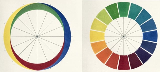
Германы физиологич Эвальд Херингийн 19-р зуунд дэвшүүлсэн онолоор улаан, шар, ногоон, цэнхэр өнгийг бусад өнгөний хольцгүй “цэвэр” өнгө гэж үздэг. Гэвч эдгээр өнгө нь нүдний гэрэл мэдрэгч эсүүд болон тархины үйл ажиллагаатай хэрхэн холбогдож байгаа нь өнөөг хүртэл нууц хэвээр байсан юм.
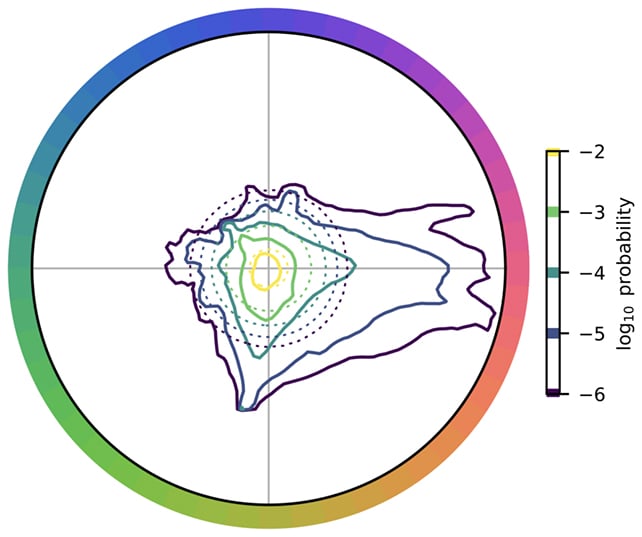
Калифорнийн их сургуулийн (UC Berkeley) судлаач Александр Белстен болон түүний багийнхан байгалийн 500 гаруй зургийг компьютерын загварчлалаар шинжилжээ. Энэхүү судалгаагаар байгаль дахь өнгөний тархалт нь тэгш бус бөгөөд улаан, шар-ногоон, цэнхэр өнгө давамгайлдаг болохыг илрүүлсэн байна.
Судлаач Бруно Олшаусений тайлбарласнаар, хүний тархи нь хүрээлэн буй орчныг таньж мэдэхдээ өнгөний мэдээллийг хялбарчлах үүднээс дээрх өнгүүдийг үндсэн “тулгуур” болгон ашигладаг. Энэхүү үйл явцыг “сийрэг кодчилол” (sparse coding) гэж нэрлэдэг бөгөөд энэ нь тархинд өнгөний мэдээллийг хамгийн үр ашигтайгаар боловсруулах боломжийг олгодог байна.
Энэхүү ололт нь 19-р зууны физиологичдын дэвшүүлж байсан өнгөний эсрэгцлийн онол буюу улаан-ногоон, шар-цэнхэр өнгүүд нь бие биеэ нөхөж, эсрэгцэн оршдог гэх таамаглалыг шинжлэх ухааны үндэслэлтэйгээр баталгаажуулж байна. Судлаачид цаашид уг судалгаагаа бодит орчин болон бусад амьтны харааны онцлогтой харьцуулан судлахаар төлөвлөж байна.
Дэлгэрэнгүйг эх сурвалжаас харах
↓Эх сурвалжийг нээх ↓
Since a 19th century theory put forward by German physiologist Ewald Hering, color scientists have considered the hues red, yellow, green, and blue to be special – something you can still see in any modern color wheel today.
These are often considered ‘pure’ colors, as in colors that aren’t thought of as mixes of anything else: whereas orange is usually thought of as a combination of yellow and red, red would be less likely to be seen as orange mixed with purple.
Despite some experimental evidence to back this up, experts have struggled to map these four hues specifically to what we know about how the eye captures light or how the brain processes colors.
That prompted researchers from the US to look for answers in nature. A new study published in the Journal of the Optical Society of America A may finally have some answers about what makes red, yellow, green, and blue stand out.
“Their special status remains a mystery,” says neuroscientist Alexander Belsten, from the University of California, Berkeley (UC Berkeley).
“No known property of light – the cone photoreceptors in the eye or neural representations in the brain – can explain why these four hues, rather than some other set, should occupy this privileged position.”
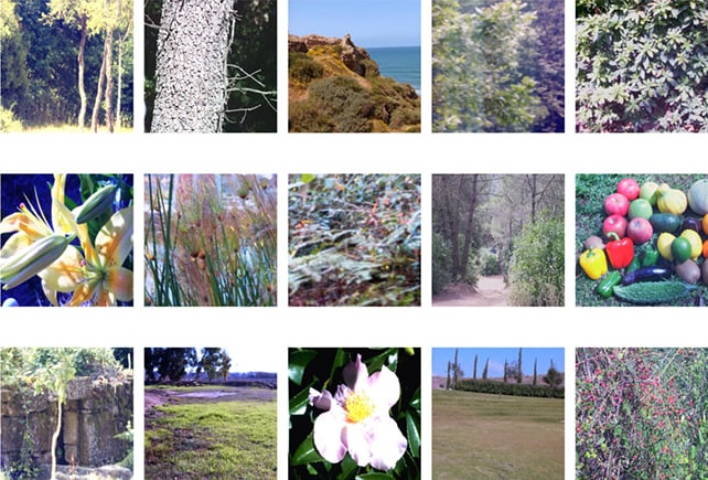
To solve the mystery, Belsten and his colleagues analyzed more than 500 images of the natural world, using computer models to simulate how the human eye would react to them through its three types of light-sensitive photoreceptor cells (cones) – one each for long, medium, and short wavelengths of light.
Effectively, the data mapped how our eyes see the world: which colors come up most often, and the signals they trigger.
Crucially, they found that nature’s palette is not an evenly spread one. There’s a tendency towards red, yellow-green, and blue.
“The color distribution in the environment is very asymmetric and non-uniform,” says neuroscientist Bruno Olshausen, from UC Berkeley. “Nobody’s ever looked at this before because the availability of these very large data sets is relatively new.”
“You need to have millions and millions of pixels to start to see the dominant colors, because some color pixels are only one in 100,000 or one in a million.”
The researchers suggest that the human brain simplifies this incoming palette by anchoring red, yellow, green, and blue (plus black and white) as the most straightforward way of encoding the world around us.
It’s technically known as sparse coding, an efficient processing of a wide range of sensory information.
If the brain wants to know how it can reproduce all of nature’s colors using as few neural ‘building blocks’ as possible, it turns out that red vs green, blue vs yellow, and black vs white works rather well.
“Sparse coding inference introduces mutual exclusivity… and yields a color representation that mirrors the phenomenology of color perception,” says Belsten.
This is a theoretical study, but it provides a fit for both the four pure hues that Hering came up with, and the three photoreceptor cones in the eyes – not by mapping each color individually, but by using combinations grouped around the main hues.

The next steps are to test these ideas out in the field, with real-world spatial layouts and shapes, and actual human participants. The team also raises the possibility of analyzing color perception in other species, to see how a variety of members of the animal kingdom might see the world differently.
“What I’m really excited about is that we have an explanation now for the first time,” says Olshausen. “All these pieces just fall together. It’s almost too good to be true.”
Related: Scientists Complete Schrödinger’s Color Theory Over 100 Years Later
“It captures exactly this idea of opponency that physiologists described back in the 19th century, which is that blue and yellow appear to be opposites and that red and green appear to be opposites.”
The research has been published in the Journal of the Optical Society of America A.